Turn your home into a fortress with these perfect home décor ideas!
Professional real estate remodelers know how to highlight your property’s assets, conceal its problems, and appeal to a wide range of buyers.
We spoke with many professionals throughout the country to obtain their advice on how to spruce up your house without breaking the bank.
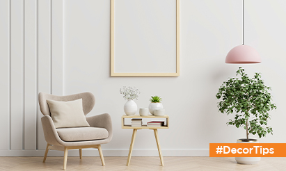
- Go for subtle and neutral colors to paint the walls
Stick to neutral hues like beige or grey on the first level, where movement is crucial. Do you want as few abrupt changes as possible? Neutral walls allow you to simply mix up your accessories, giving you the most design versatility. If you have two tiny rooms adjacent to each other, painting them the same neutral hue will help them feel more spacious. For a small change from room to room, look at a paint strip and adjust up or down a shade or two.
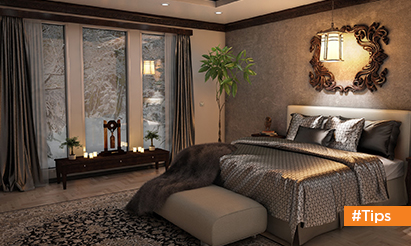
- Every room should have at least one mirror
Because they bounce light throughout the room, mirrors may make a room feel brighter. However, putting one in the incorrect place is nearly as terrible as not having one at all.Mirrors should be hung perpendicular to windows rather than straight across from them. When a mirror is hung directly across from a window, the light is reflected out the window.
- Set the tone from the moment you walk through the door
Paint the front door a bright, glossy color if you want to make a good first impression. Many civilizations consider red to be a fortunate color! In early America, a crimson door symbolized “welcome” to weary visitors, and on churches, it signifies a safe sanctuary. Orange and yellow are two more colors that are gaining popularity. Both hues evoke feelings of happiness and warmth. An out-of-date screen door is one item that should be removed. Remove it or replace it with a storm door that has full-length glass and can be replaced with a screened panel.
- Adapt Artwork to the Size of Your Wall
Few things look more absurd than putting a bunch of little paintings up too high on the wall. The center of a painting should be at eye level. If one individual is short and the other is tall, their heights should be averaged. Consider scale as well; if you have a huge wall, go big with one gigantic piece or combine smaller pieces in a gallery-style arrangement. When it comes to the latter, keep the photographs close together; 2 to 4 inches between objects looks ideal.
- Raise the Ceiling using Visual Tricks
If your ceilings are low, paint them white to make the space feel more spacious. Hang drapes higher above the windows to give the impression that the space is bigger. Most conventional curtain panels are 84 or 96 inches long, which allows you to hang them about 3 inches above the window frame before they become too short. You’ll need to buy bespoke curtains if you wish to hang them higher. Do you like patterned panels? Vertical stripes are a great way to visually lengthen your walls. A taller space may be created by leaning a huge mirror against a wall.
Disclaimer: The views expressed above are for informational purposes only based on industry reports and related news stories. PropertyPistol does not guarantee the accuracy, completeness, or reliability of the information and shall not be held responsible for any action taken based on the published information.


